Design that drives action

Menu
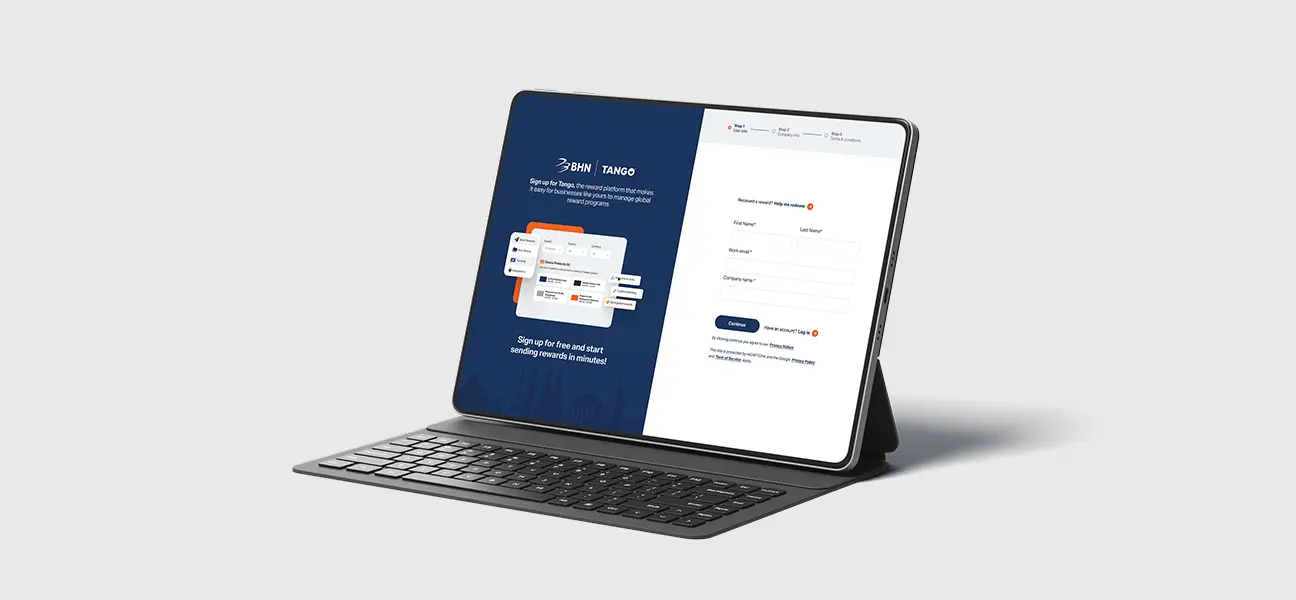
Reduced friction in the registration flow by breaking a long form into clear, guided steps
Lowered abandonment risk in a high-intent moment of the user journey
Strengthened trust and brand continuity after the BHN acquisition through clearer co-branding
Created a scalable foundation for future optimization through A/B-tested creative approaches
Improved clarity around the product value during sign-up, reducing early confusion

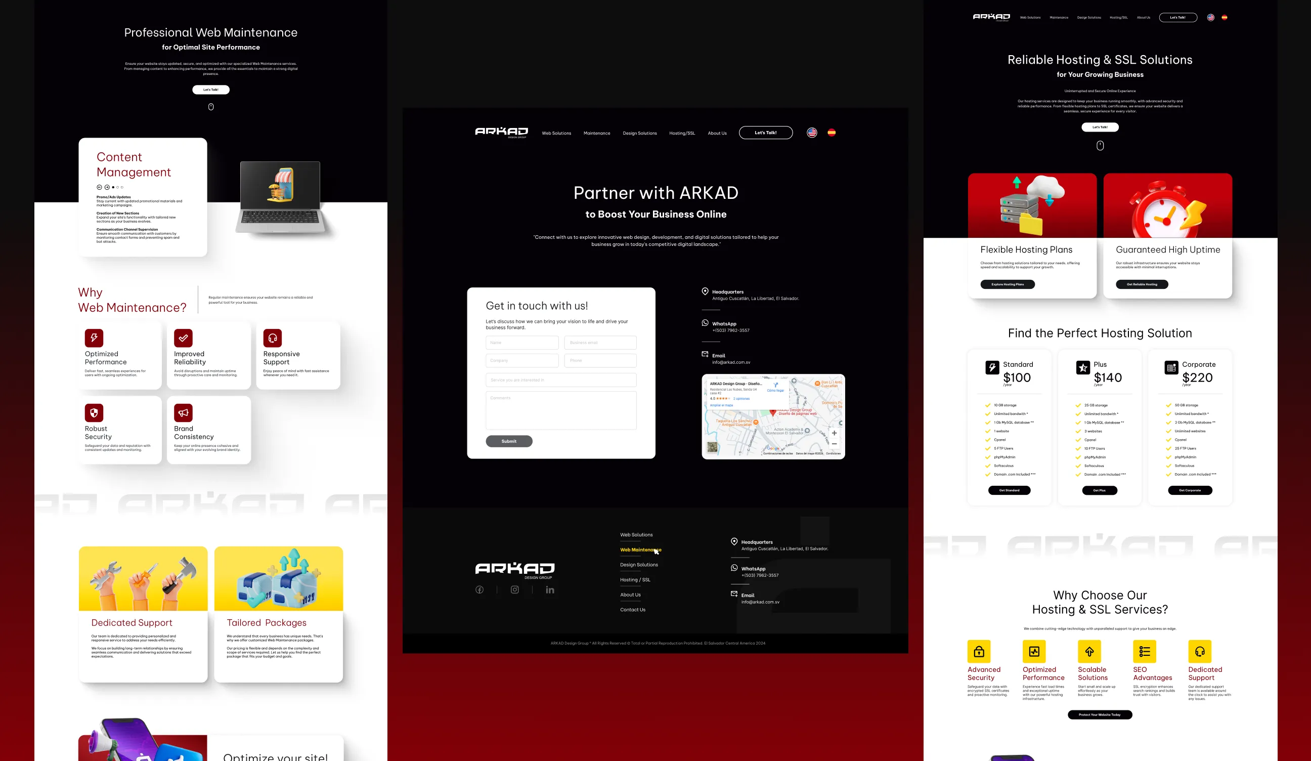
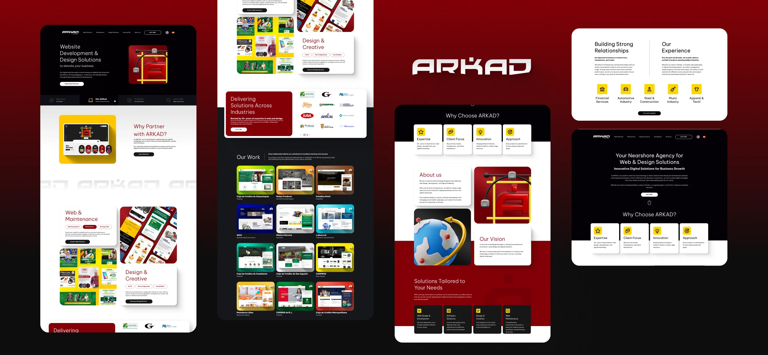
ARKAD Studio is a web solutions studio offering website development, e-commerce, and ongoing maintenance services. While the agency had strong technical capabilities, the existing website did not clearly communicate its value, services, or expertise.
This project was a full redesign and structural overhaul, focused on improving usability, modernizing the visual language, and creating a clear and scalable service narrative. The goal was to help potential clients quickly understand what ARKAD does, build trust from the first interaction, and move confidently toward contacting the team.
Understanding the Core Problem Behind User Confusion
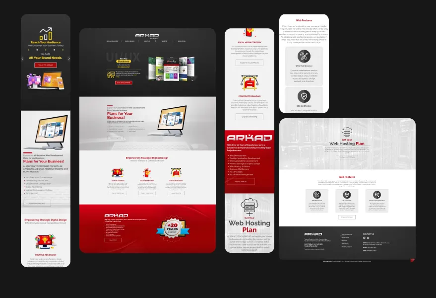
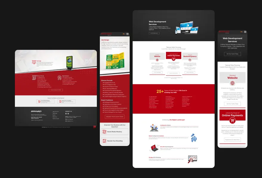
The previous website suffered from several usability and communication issues:
Constraints & Context
The redesign had to work within several practical constraints. As an active agency website, the platform needed to remain clear and flexible while services, offerings, and messaging continued to evolve. Content depth varied across services, making it necessary to design a structure that could scale without constant redesign.
Brand perception was another key consideration. As a digital agency, the website needed to communicate professionalism and expertise while avoiding visual overdesign that could distract from clarity or slow down decision-making. Additionally, the onboarding flow had to collect essential lead information without creating friction or long forms that could discourage potential clients.
These constraints shaped a solution focused on modularity, clarity, and efficiency, ensuring the website could support both marketing goals and day-to-day operations.
Results & Impact
Impact was a key focus early in the redesign.
While hard conversion metrics were limited, internal feedback confirmed better client understanding and more focused conversations during onboarding.
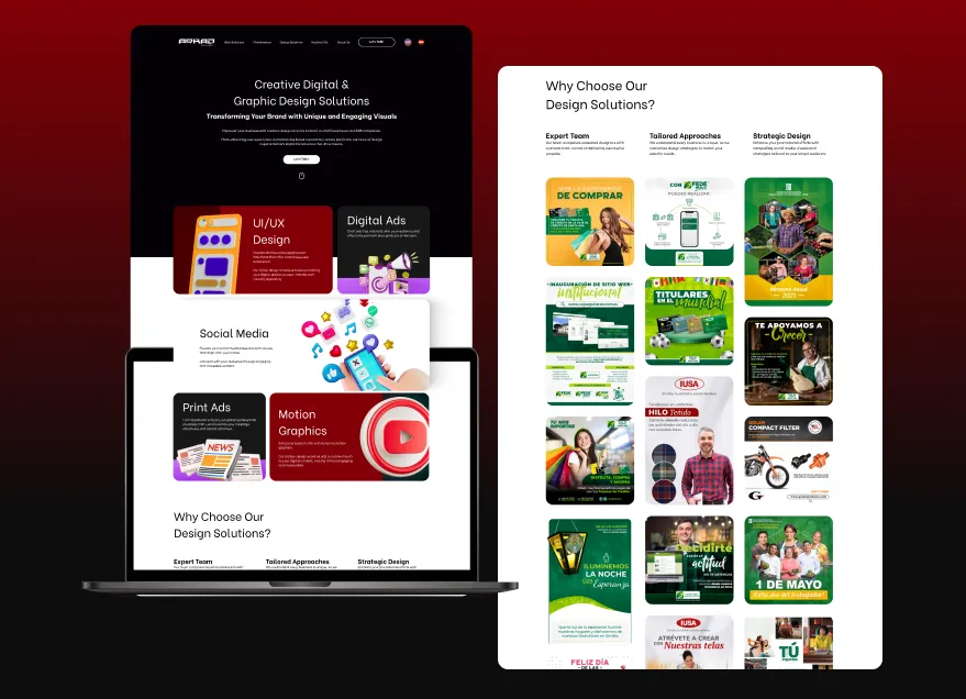
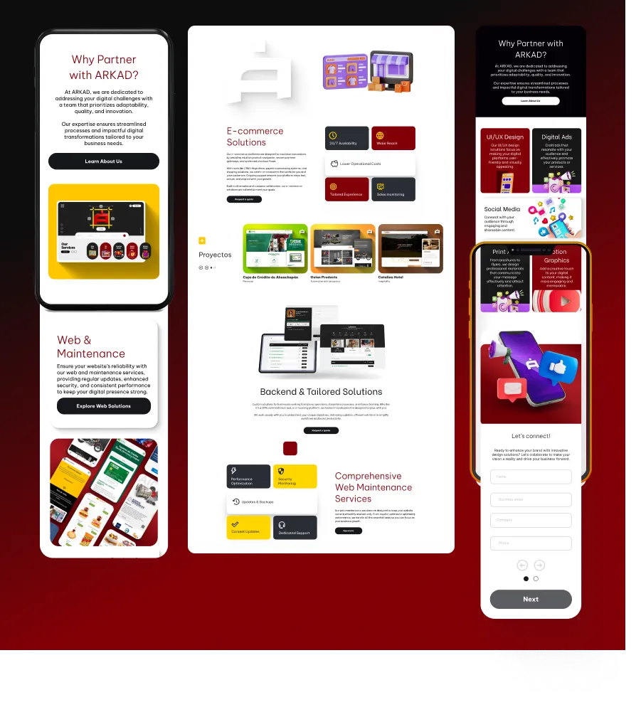
Process & Solution
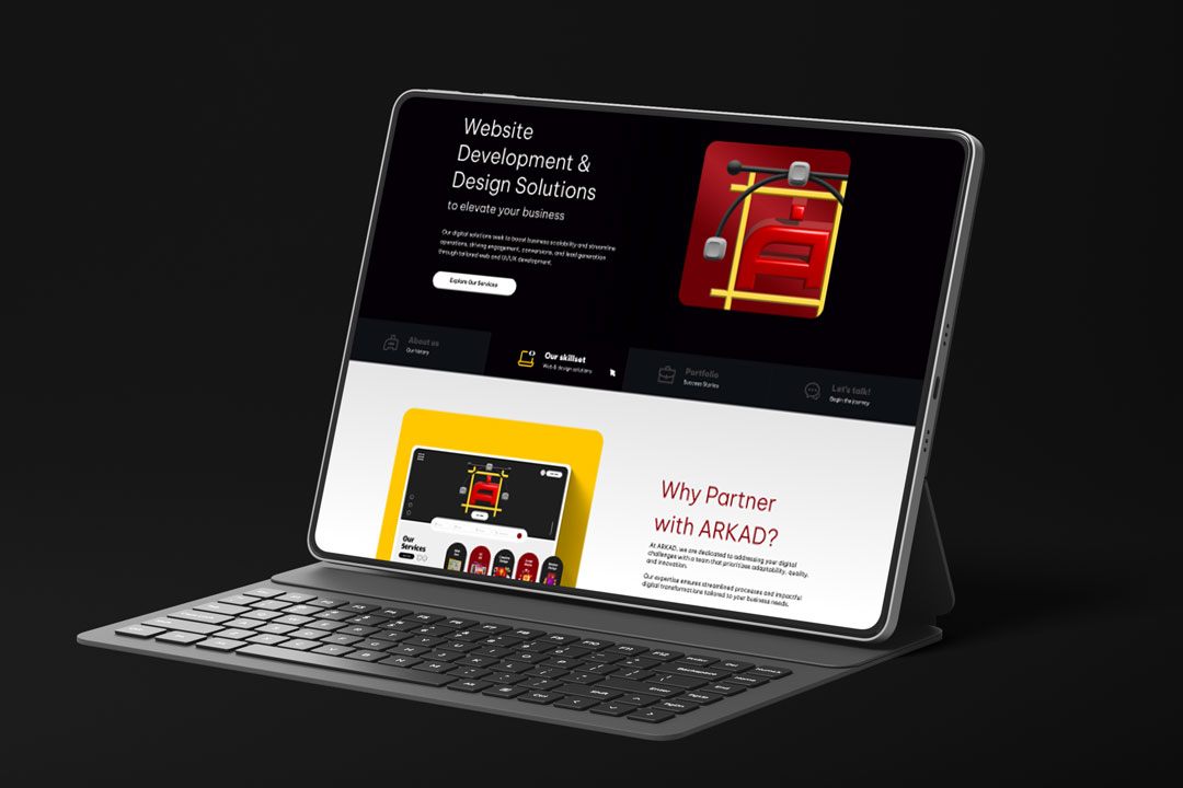
The redesign started by reorganizing content around user intent. Service discovery, credibility, and clear next steps became the foundation of the experience.
AI-assisted tools supported early content organization, competitor scans, and accessibility checks, helping validate layout decisions and reduce bias during exploration.
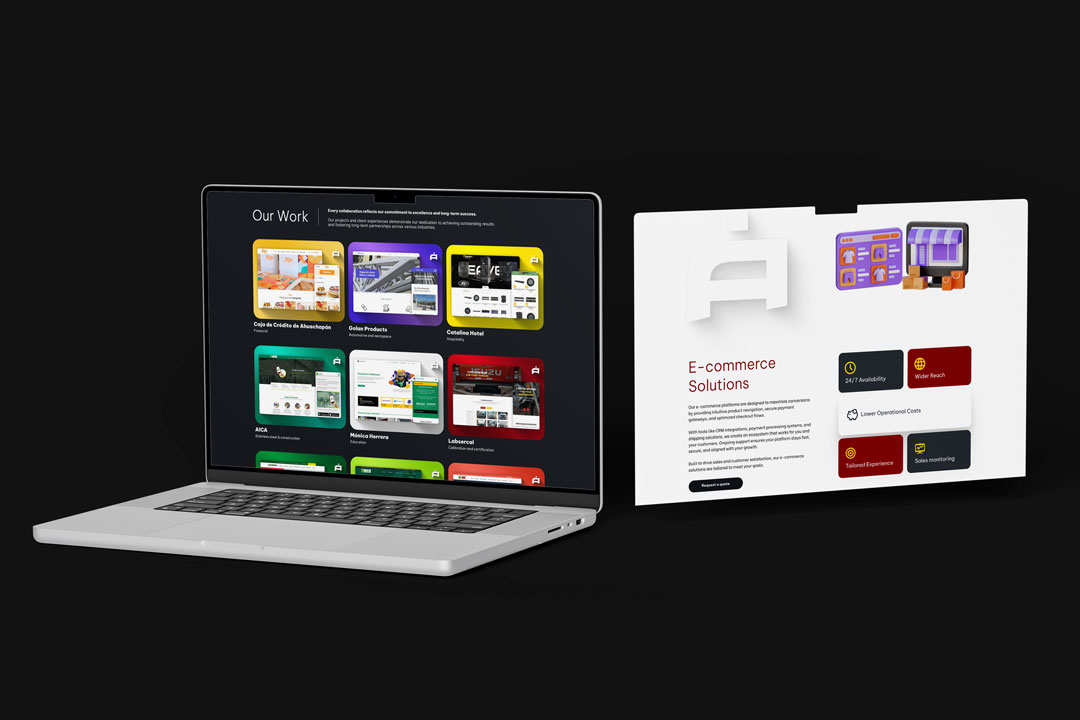
Business Impact & Operational Value
Beyond visual improvements, this redesign directly supported the lead generation and onboarding process. By clearly structuring services, expectations, and value propositions, the website began filtering leads more effectively before the first contact.
Potential clients arrived with a better understanding of available services, reducing the time spent explaining basics during discovery calls. This helped streamline onboarding, shorten initial conversations, and improve the quality of incoming leads.
Clear service definitions, improved user flow, and focused calls to action also reduced back-and-forth communication when requesting project details, allowing the team to move faster from first contact to proposal. As a result, the website evolved from a simple marketing asset into a practical tool for improving sales efficiency and internal workflows.