Using UX design and A/B testing to improve employee benefit engagement

Impact

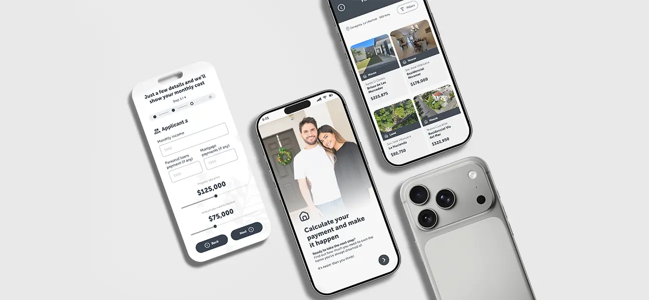
Reduced friction in the registration flow by breaking a long form into clear, guided steps

Lowered abandonment risk in a high-intent moment of the user journey

Strengthened trust and brand continuity after the BHN acquisition through clearer co-branding

Created a scalable foundation for future optimization through A/B-tested creative approaches

Improved clarity around the product value during sign-up, reducing early confusion

General-Info
Client
BHN Extras UK
Role
Information architecture, user flow, landing page design, responsive design, usability improvements
Tools
Figma, Figma Make, Photoshop, Illustrator.
Visit Website
Arrow

Optimizing Cyclescheme, BHN Extras digital experience to support employer acquisition and engagement

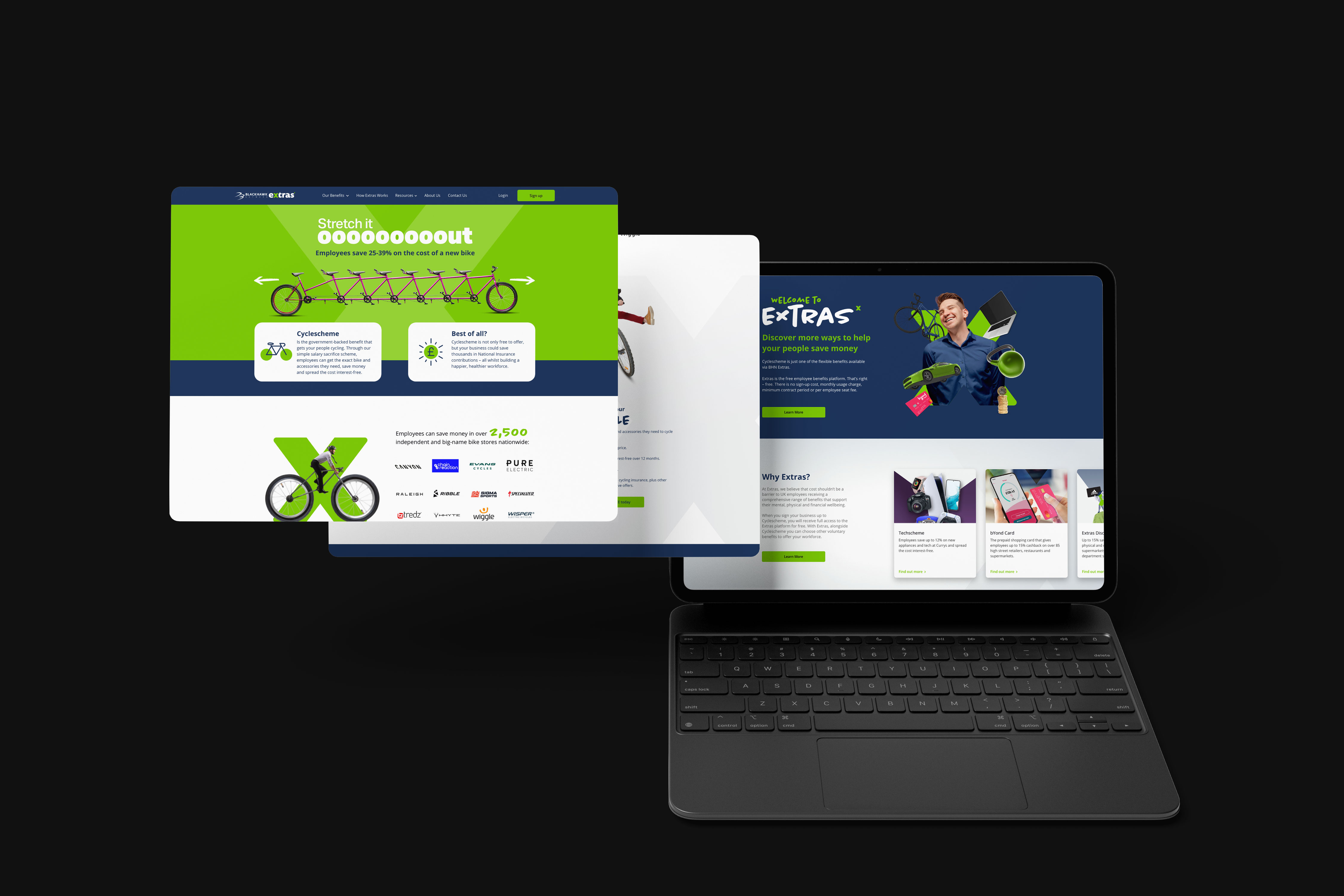
This project focused on Cyclescheme, one of the benefits offered within the BHN Extras ecosystem. The goal was to create a focused digital experience that could support an acquisition campaign aimed at employers, helping them quickly understand the value of offering Cyclescheme to their teams.

The job was approached as a campaign-driven UX initiative, combining interface design, A/B testing, and supporting marketing assets to drive qualified employer leads.
Understanding the Core Problem
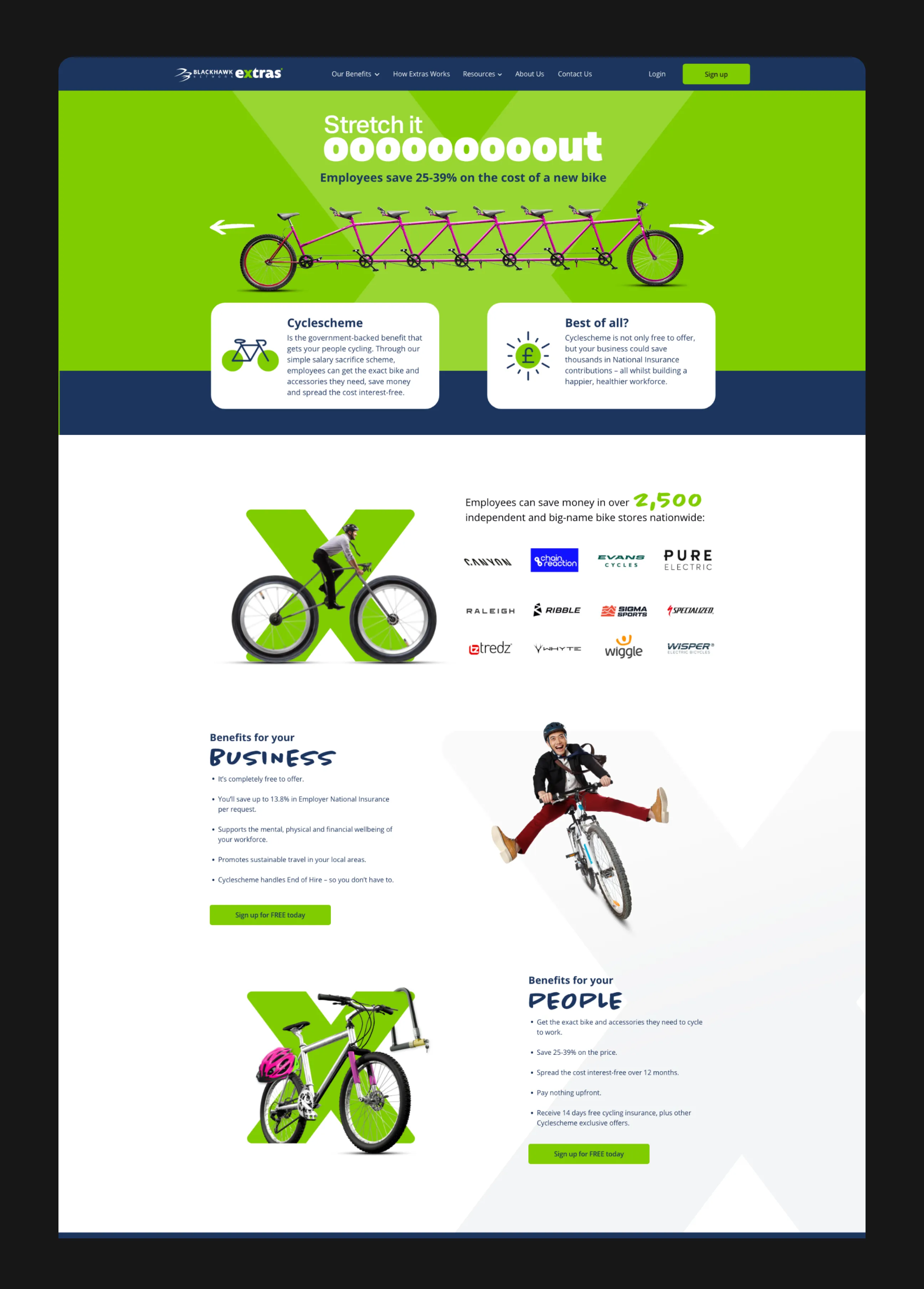
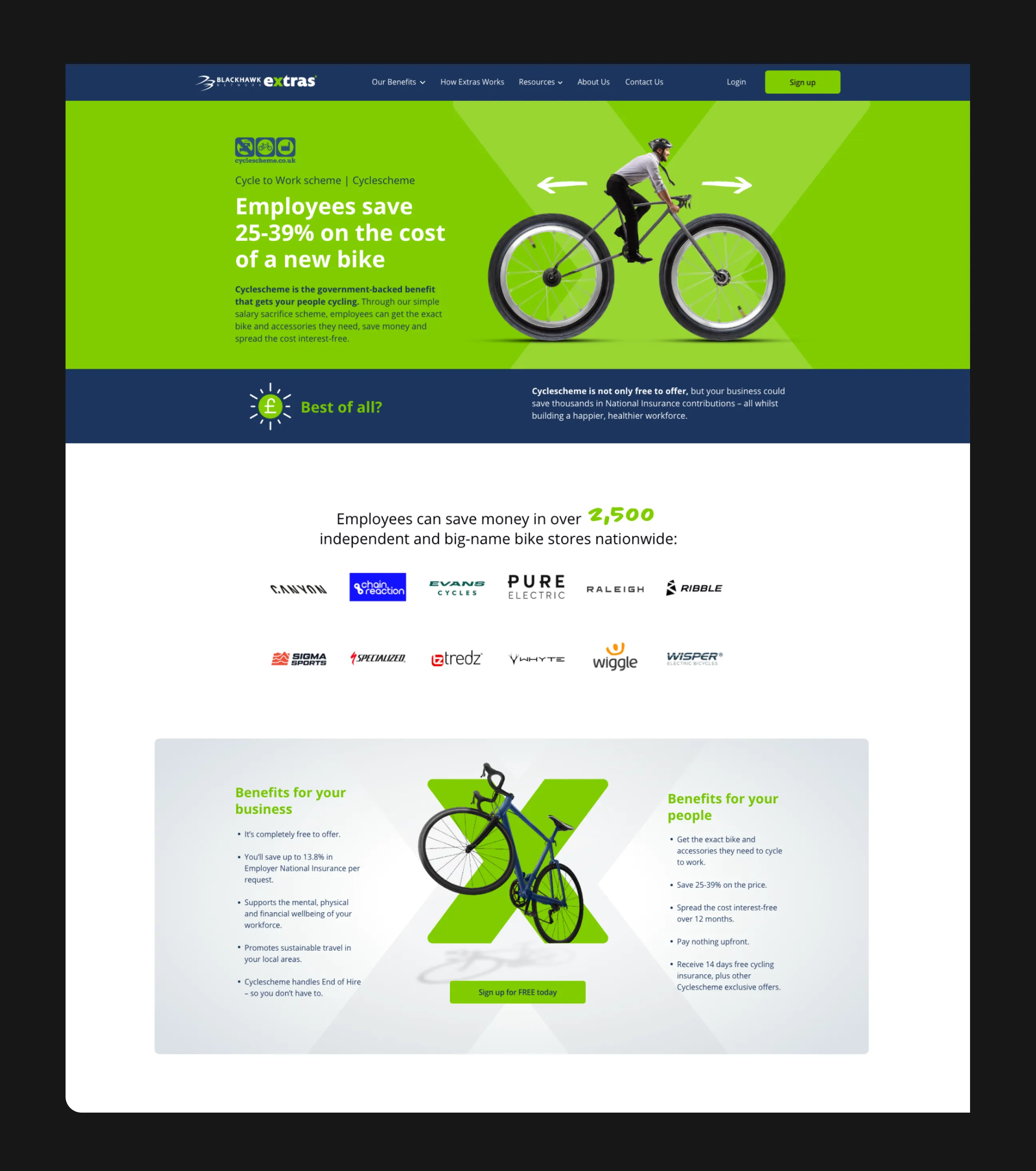
Clarifying value for different audiences without overwhelming them

Early analysis raised several key questions:

  • How can Cyclescheme’s financial and operational benefits be communicated clearly to employers in a short interaction?
  • What information is essential before an employer is willing to submit their details?
  • How can paid traffic be aligned with on-page messaging to avoid drop-off?

Initial versions of the experience struggled with dense explanations and unclear prioritization, making it harder for users to quickly grasp why Cyclescheme was relevant to their organization.

Constraints & Context

Balancing compliance, marketing goals, and user clarity

  • Cyclescheme includes financial and compliance-related information that needed to remain accurate
  • The experience had to support employer-focused lead generation
  • Traffic was driven through paid ads, increasing the importance of message consistency
  • The project followed a campaign-based timeline, requiring fast iteration and validation

These constraints required a balance between clarity, persuasion, and trust.
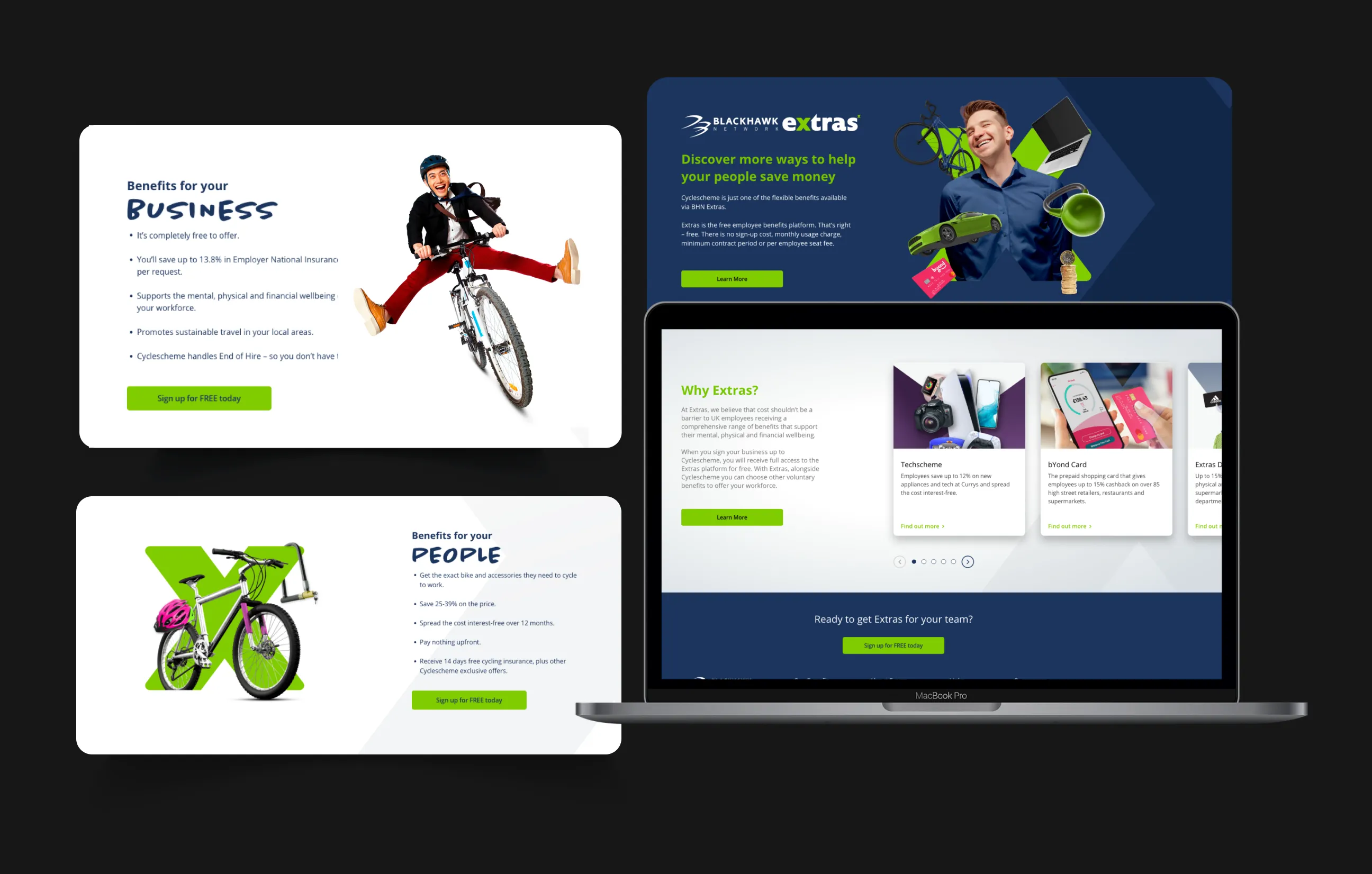
These constraints shaped a solution that emphasized clarity, focus, and adaptability.

Results & Impact

Making benefits easier to scan, understand, and act on

  • The final experience presented Cyclescheme’s value earlier and more clearly in the flow, allowing employers to self-qualify before engaging further. Content hierarchy and visual structure improved scannability, making it easier to understand savings, eligibility, and implementation at a glance.
  • A/B testing allowed different messaging and layouts to be evaluated, helping refine how benefits were presented and how calls to action were framed. This resulted in a more confident path toward lead submission.

Process & Solution

Structuring content to guide users from awareness to sign-up

The solution focused on aligning UX, messaging, and acquisition channels:
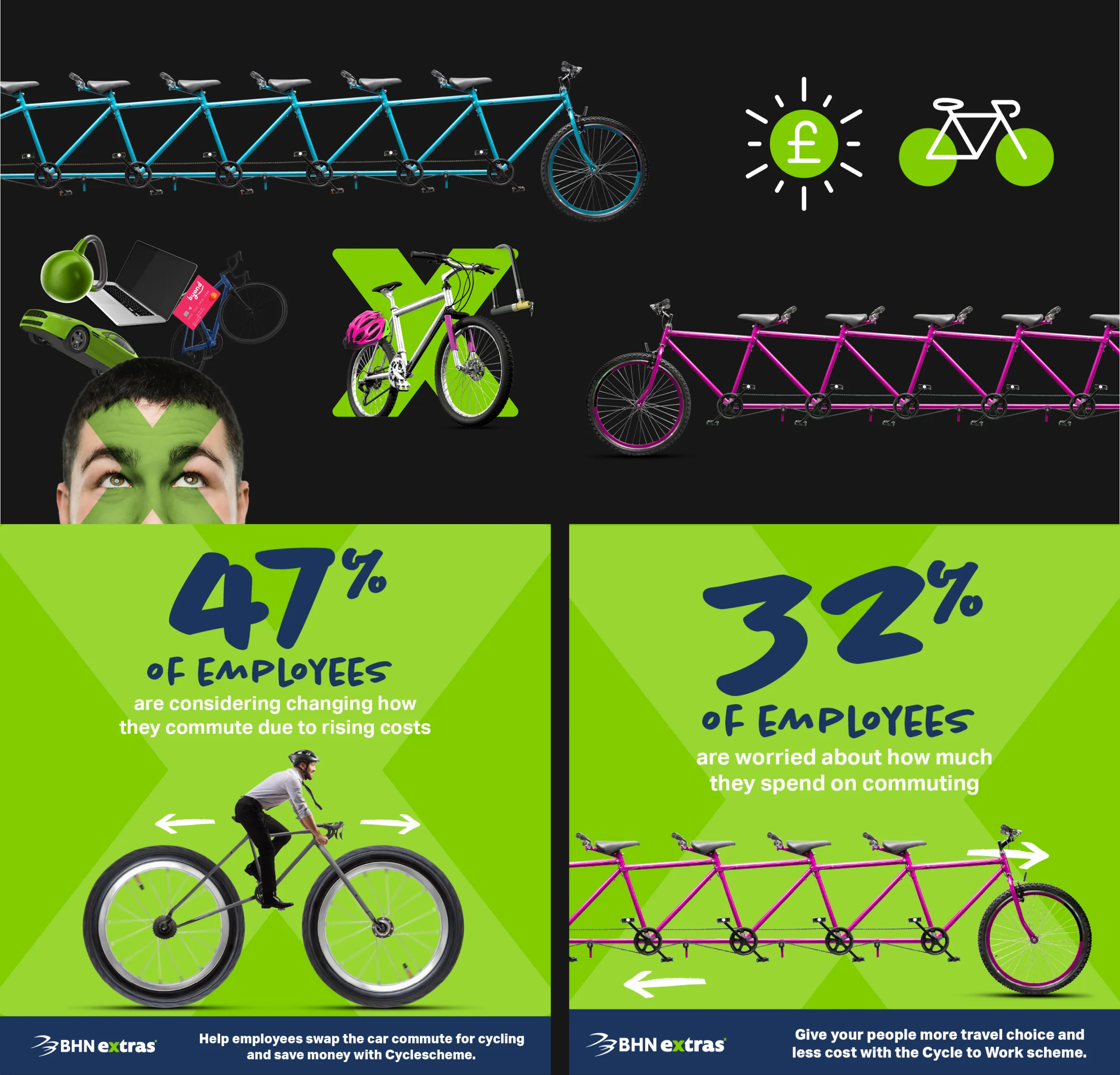
  • Content was restructured to lead with employer value before details
  • Messaging was adjusted and tested through A/B variants
  • Clear visual hierarchy supported fast scanning for paid traffic users
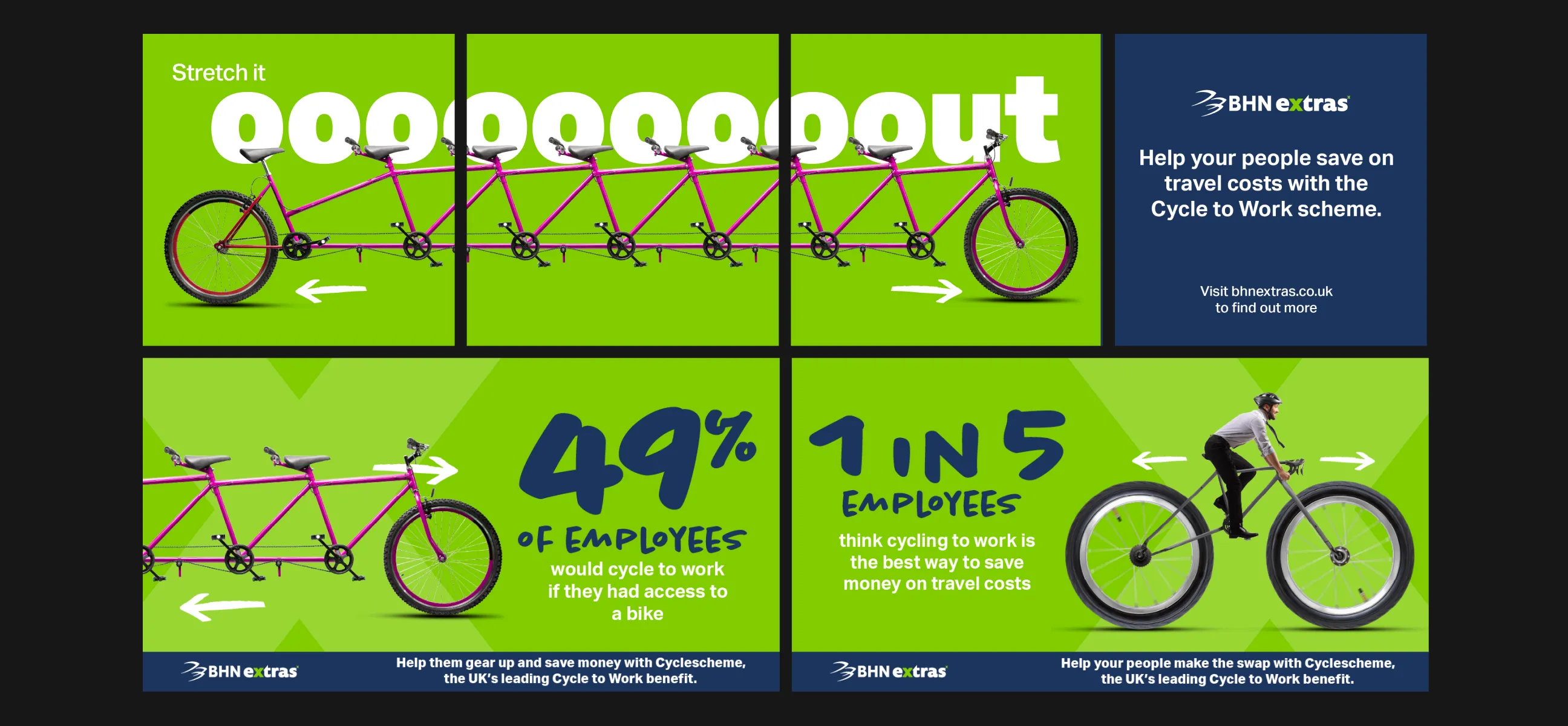
  • Supporting assets for paid ads and social media were designed to reinforce the same value propositions

Business Impact & Operational Value

How clearer messaging supports engagement and benefit adoption

By improving how Cyclescheme is presented to employers, the experience supports more qualified leads and better-informed conversations during onboarding. Employers arrive with clearer expectations, reducing friction and follow-up clarification.

From a business perspective, this campaign-based approach allows BHN Extras to reuse and adapt the structure for future benefit promotions, turning the experience into a repeatable acquisition model rather than a one-off page.