Designing a clearer signup experience for global rewards management

Impact

Reduced friction in the registration flow by breaking a long form into clear, guided steps

Lowered abandonment risk in a high-intent moment of the user journey

Strengthened trust and brand continuity after the BHN acquisition through clearer co-branding

Created a scalable foundation for future optimization through A/B-tested creative approaches

Improved clarity around the product value during sign-up, reducing early confusion

General-Info
Client
BHN-Tango
Role
UI/UX Designer. User flow design, information architecture, responsive design, usability improvements, and visual system definition.
Tools
Figma, Photoshop, Lucidchart
Visit Website
Arrow

Improving conversion and clarity in TANGO's self-serve rewards signup flow

Tango’s self-serve portal allows businesses to manage rewards and incentives from a single platform. While traffic volume was strong, analytics revealed significant drop-offs during the registration process, preventing users from completing account creation and accessing the product.

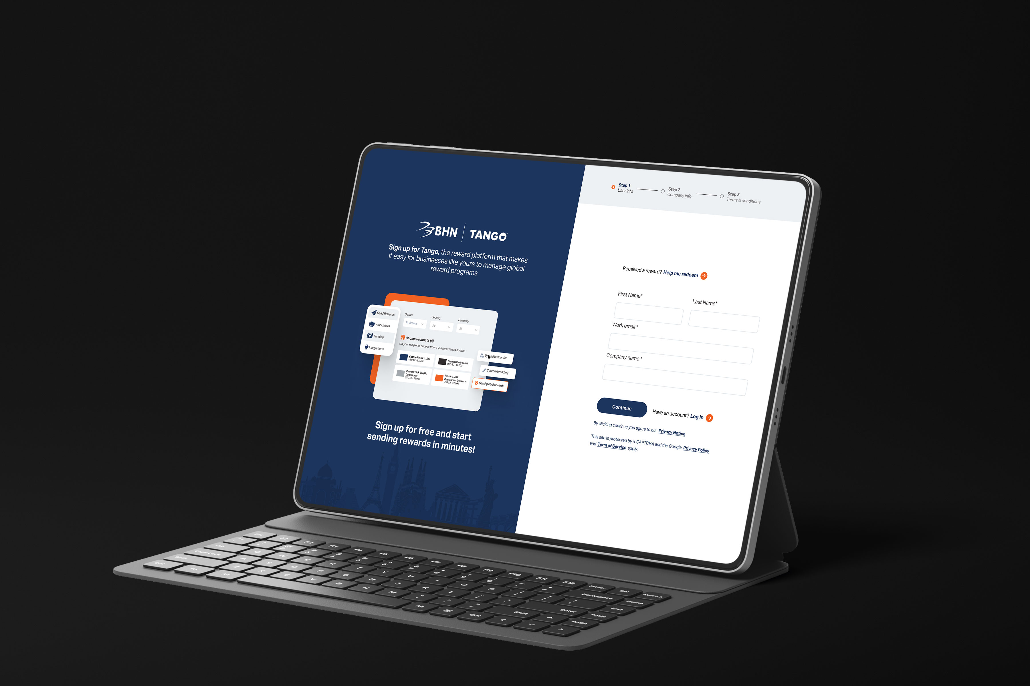
This project focused on conversion optimization through UX redesign, improving clarity, trust, and flow completion. The work included restructuring the signup journey, updating visual communication after Tango’s acquisition by BHN, and validating design decisions through creative A/B testing.
Understanding the Core Problem

Where and why users were abandoning the signup flow

Traffic analysis showed that a large number of users started the registration process but failed to complete it. Key questions emerged early in the discovery phase:

  • Why were users dropping off before finishing registration?
  • Was the portal clearly communicating what the product does and who it’s for?
  • Did the signup flow feel too demanding or unclear at first glance?
  • Was the Tango brand transition creating uncertainty or lack of trust?

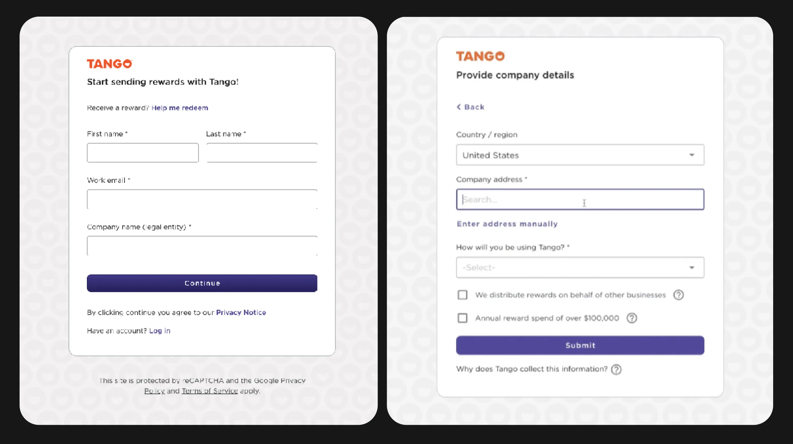
The existing flow presented too much information at once, lacked visual hierarchy, and did not clearly set expectations about the steps required to complete registration.
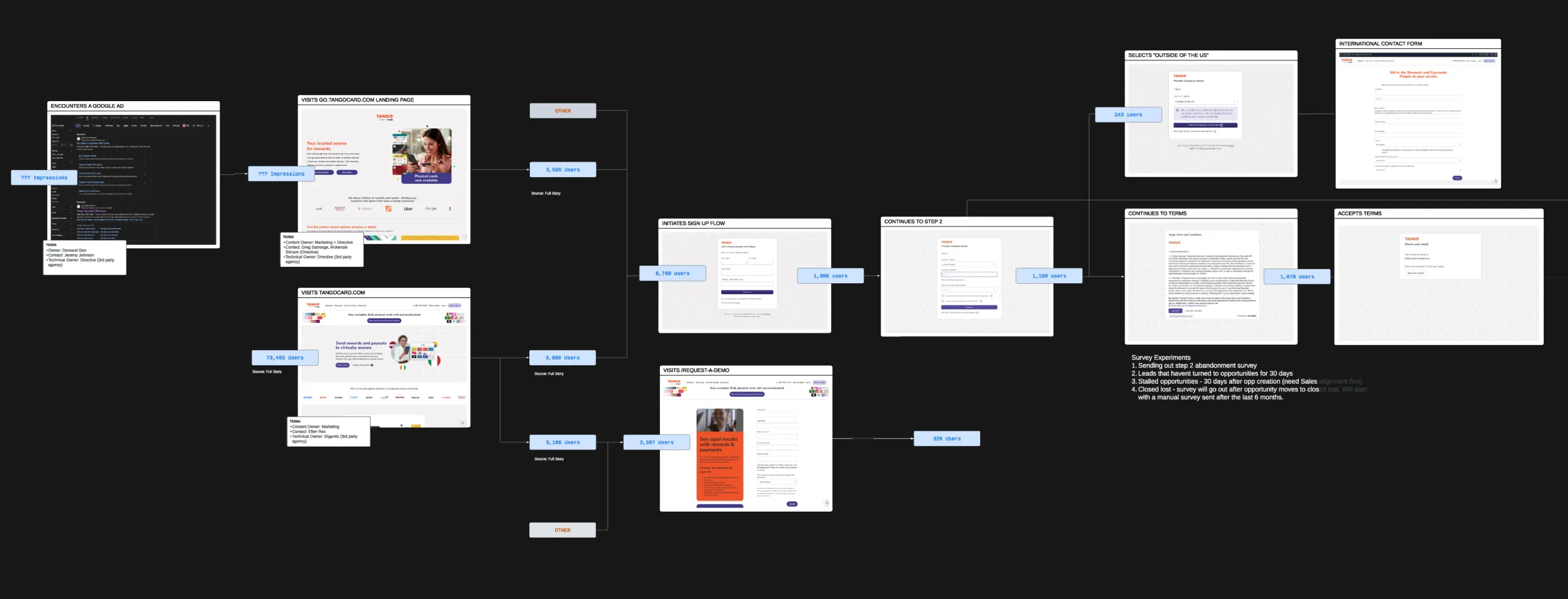
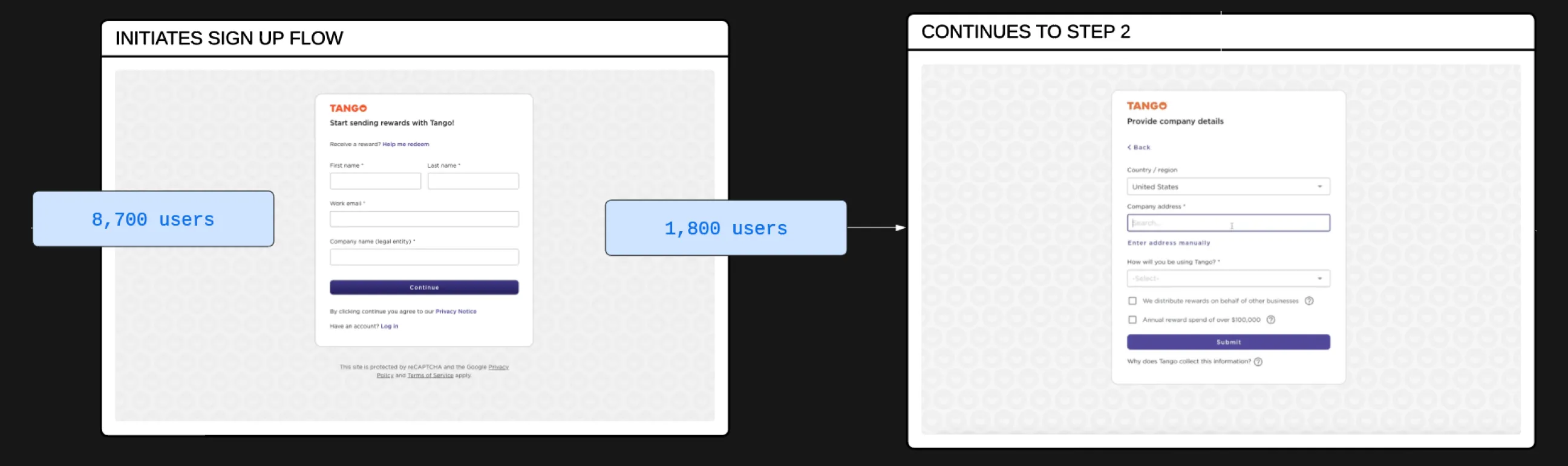
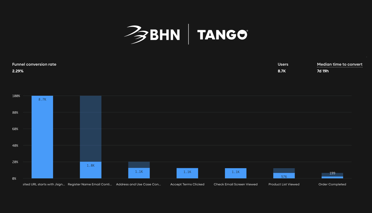
Comprehensive flow data

Data showed a 79% drop, falling from 8,700 to 1,80 after the first step

Stage showing the biggest drop-offs in the original experience

Constraints & Context

Designing within compliance, brand transition, and conversion goals

  • The portal needed to comply with legal and security requirements for account creation.
  • The redesign had to reflect Tango’s acquisition by BHN without confusing existing or new users.
  • Marketing traffic was already being driven through paid ads, so improvements had to focus on post-click experience rather than acquisition.
  • Changes needed to be validated through A/B testing, not assumptions.

These constraints required a solution that balanced clarity, trust, and performance without increasing friction.

Results & Impact

Making the signup experience easier to follow and complete

  • Reduced cognitive load by breaking registration into clear, manageable steps.
  • Improved scannability and comprehension of what the portal offers.
  • Increased user confidence by clearly communicating brand ownership and legitimacy.
  • Created a more predictable and less intimidating signup experience.

While full business metrics were handled internally, internal feedback and behavior patterns showed stronger step-to-step progression and fewer early exits.
Process & Solution

Structuring the flow to guide users from intent to completion

The redesign focused on simplifying decision-making and setting expectations early:

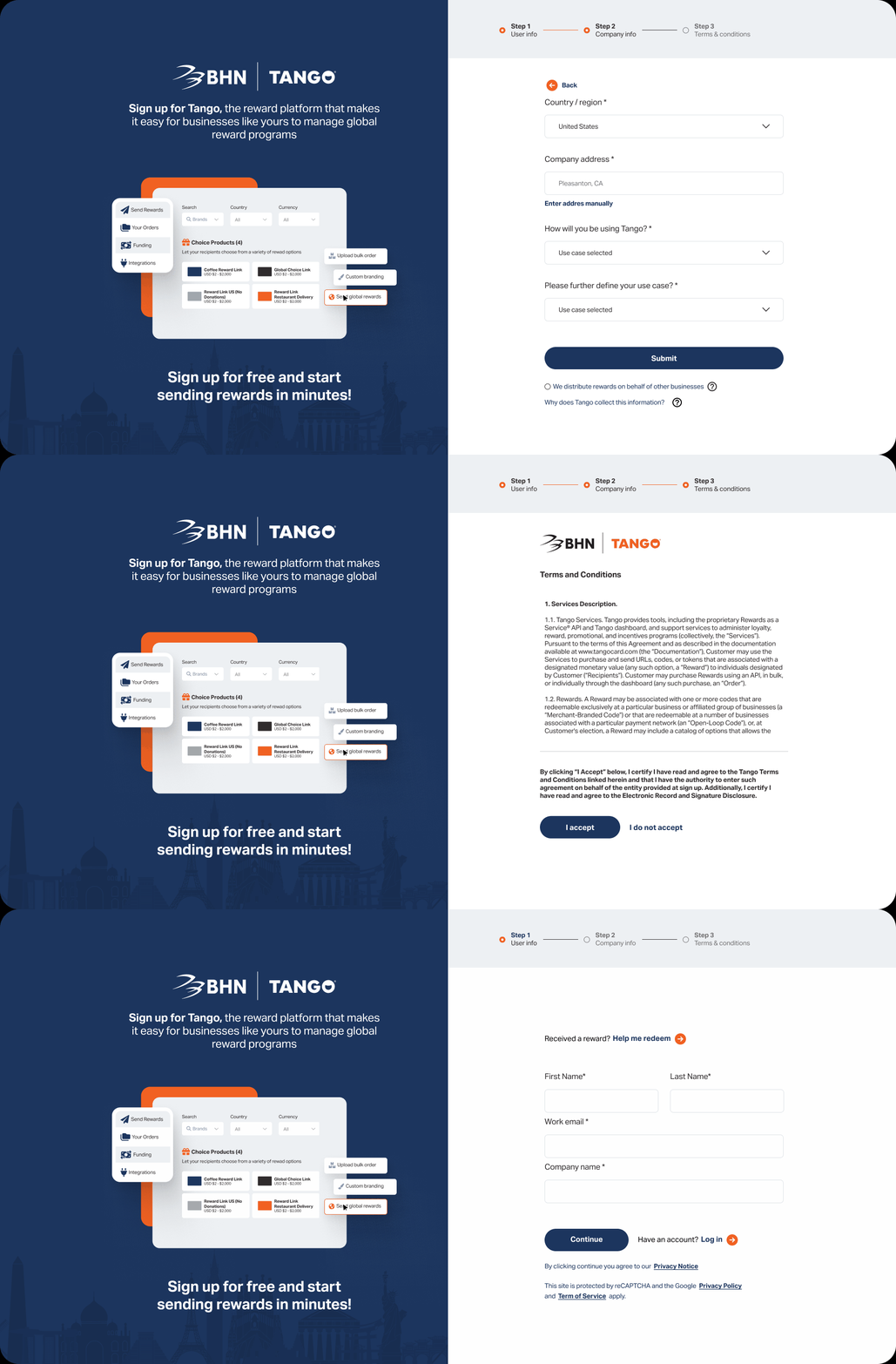
  • The registration was divided into clear sequential steps, allowing users to focus on one task at a time.
  • Visual hierarchy and spacing were improved to reduce form fatigue.
  • Messaging was rewritten to explain the platform’s value before asking for commitment.
  • The UI was updated to reflect the new BHN x Tango co-brand, reinforcing trust and continuity.
  • Accessibility considerations were applied to form inputs, contrast, and focus states.

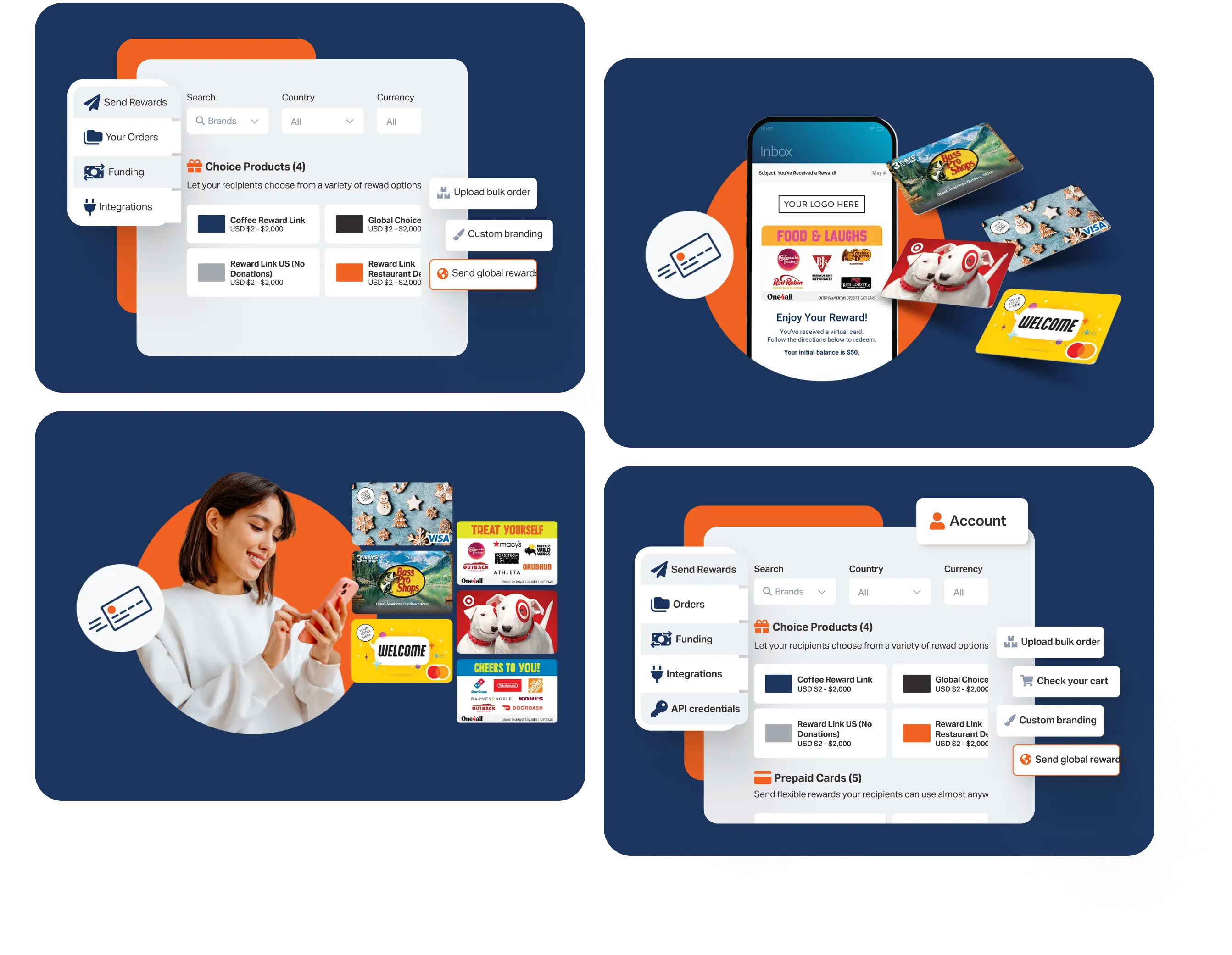
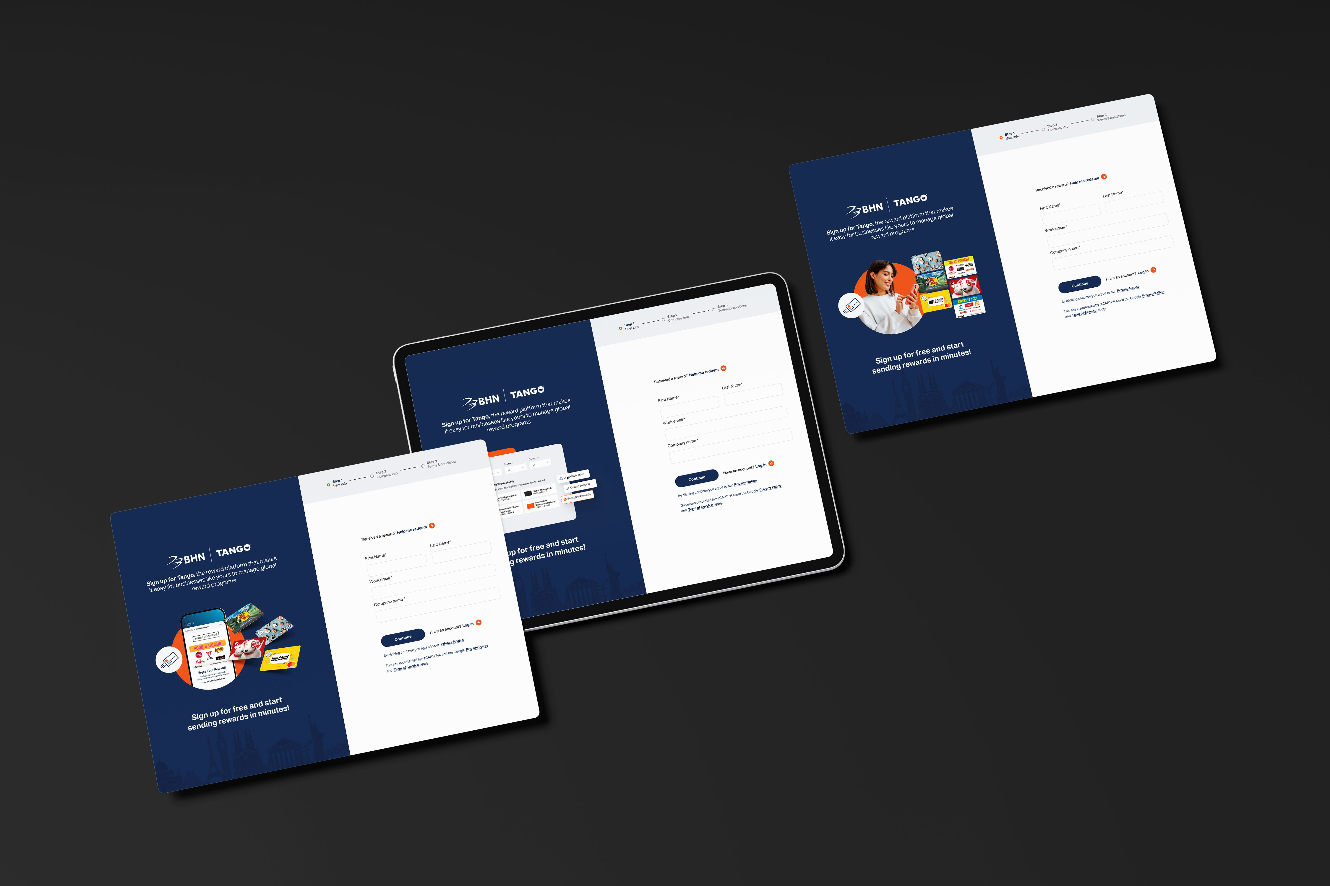
To validate direction, creative A/B testing was introduced with three concepts:

  1. Feature-focused concept explaining platform capabilities
  2. “Easy reward delivery” concept emphasizing simplicity
  3. Lifestyle-driven concept connecting rewards to real-world impact

Each variation tested how visual context and messaging influenced completion behavior.
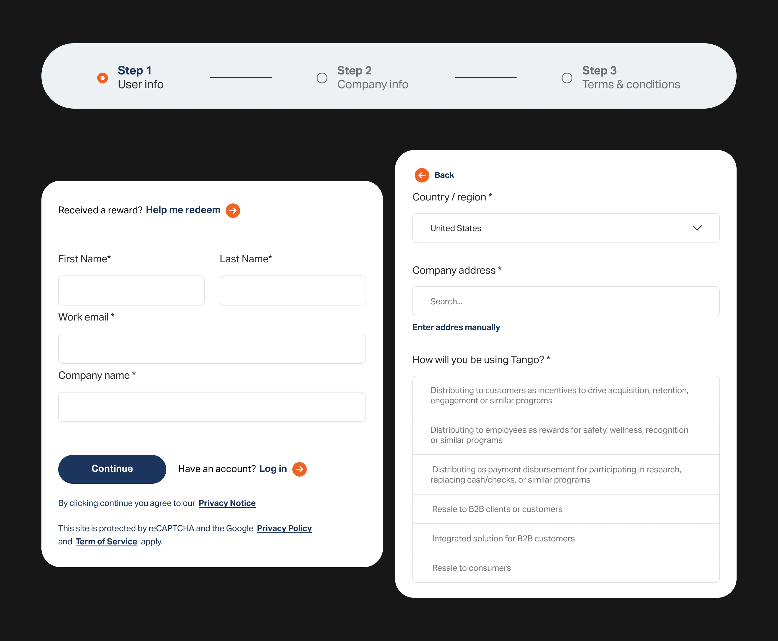
Improved messaging hierarchy and clearer stage communication throughout the registration process.

Business Impact & Operational Value

How improved clarity supports activation and product adoption

A clearer and more structured signup flow reduces friction at a critical activation point. By helping users complete registration successfully, the platform increases the likelihood of product exploration, reward creation, and long-term usage.

From an operational perspective, clearer onboarding reduces confusion, minimizes support dependency during account setup, and ensures that paid acquisition efforts lead to qualified, activated users instead of incomplete sessions.