Design that drives action

Menu
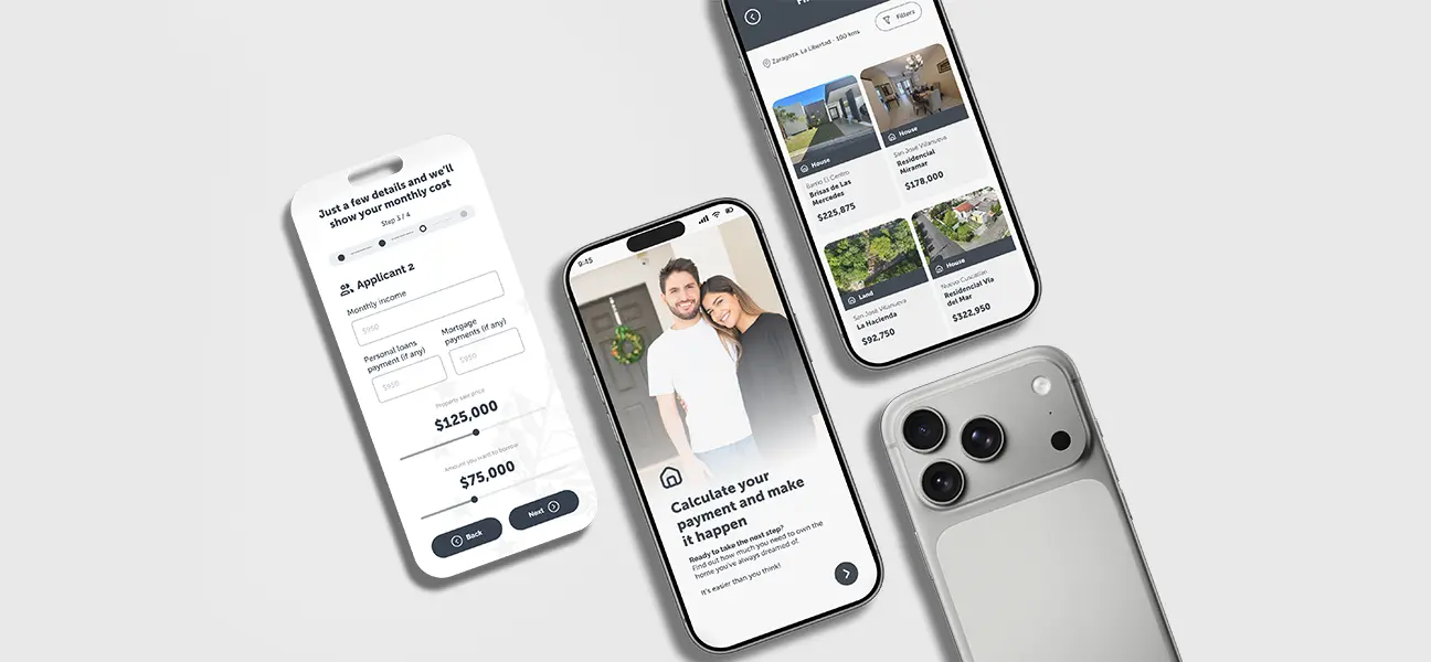
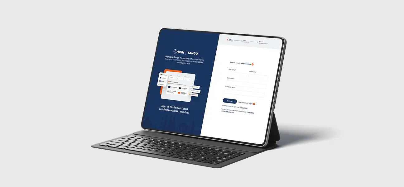
Reduced friction in the registration flow by breaking a long form into clear, guided steps
Lowered abandonment risk in a high-intent moment of the user journey
Strengthened trust and brand continuity after the BHN acquisition through clearer co-branding
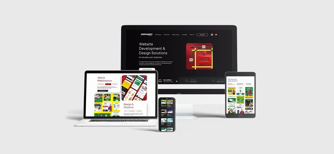
Created a scalable foundation for future optimization through A/B-tested creative approaches
Improved clarity around the product value during sign-up, reducing early confusion

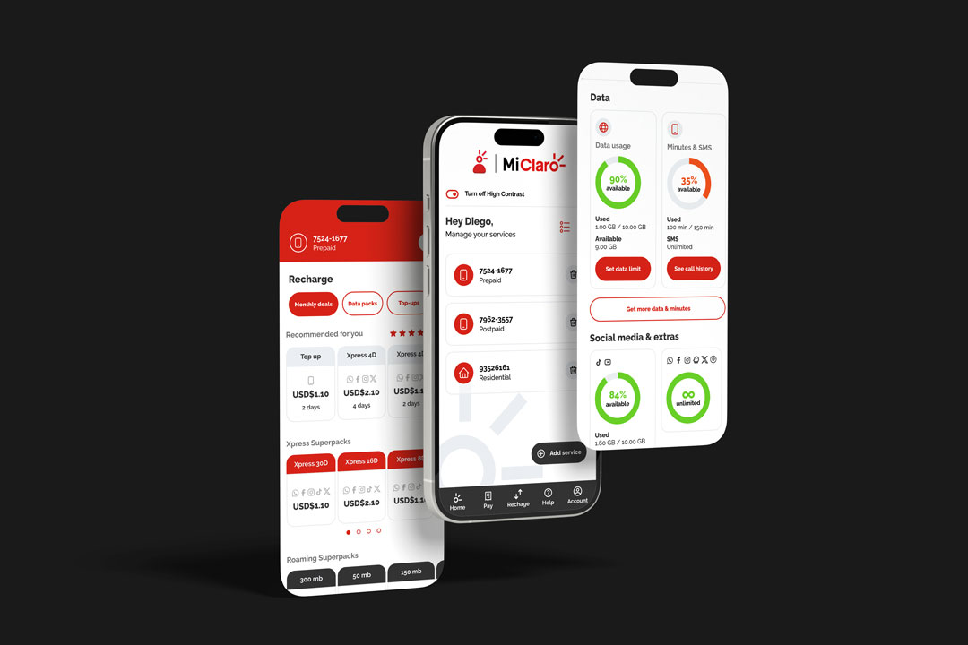
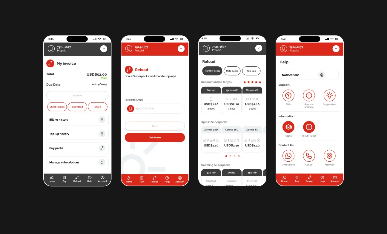
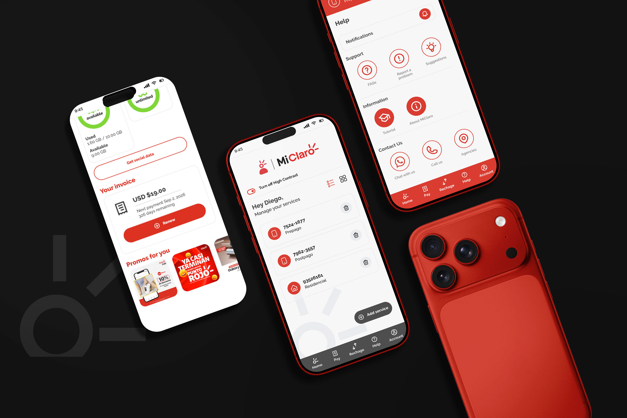
Mi Claro is a self-service mobile app used frequently by telecom customers to manage balances, plans, payments, and services. The existing experience had grown complex over time, making simple actions harder to complete and increasing user frustration.
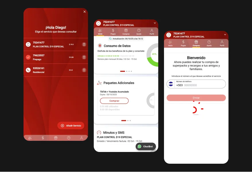
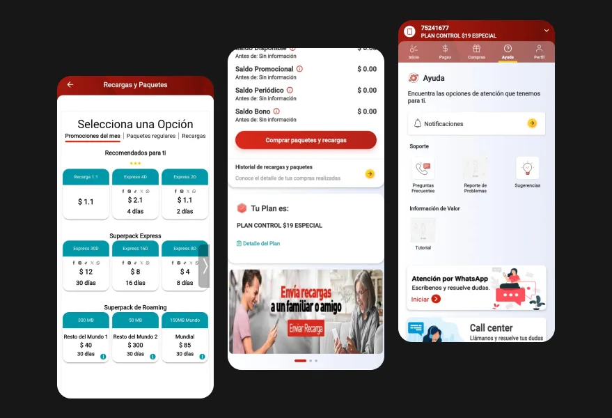
This project focused on reworking the information architecture, task flow, and visual hierarchy to support faster interactions, clearer decision-making, and a more consistent experience across the app.
Understanding the Core Problem
Several questions guided the redesign from the start:
Analysis of the current app revealed:
Constraints & Context
These constraints required design decisions that balanced simplicity with completeness, without oversimplifying the product.
Results & Impact
Even without hard metrics, usability improvements were evident through flow analysis and design validation:
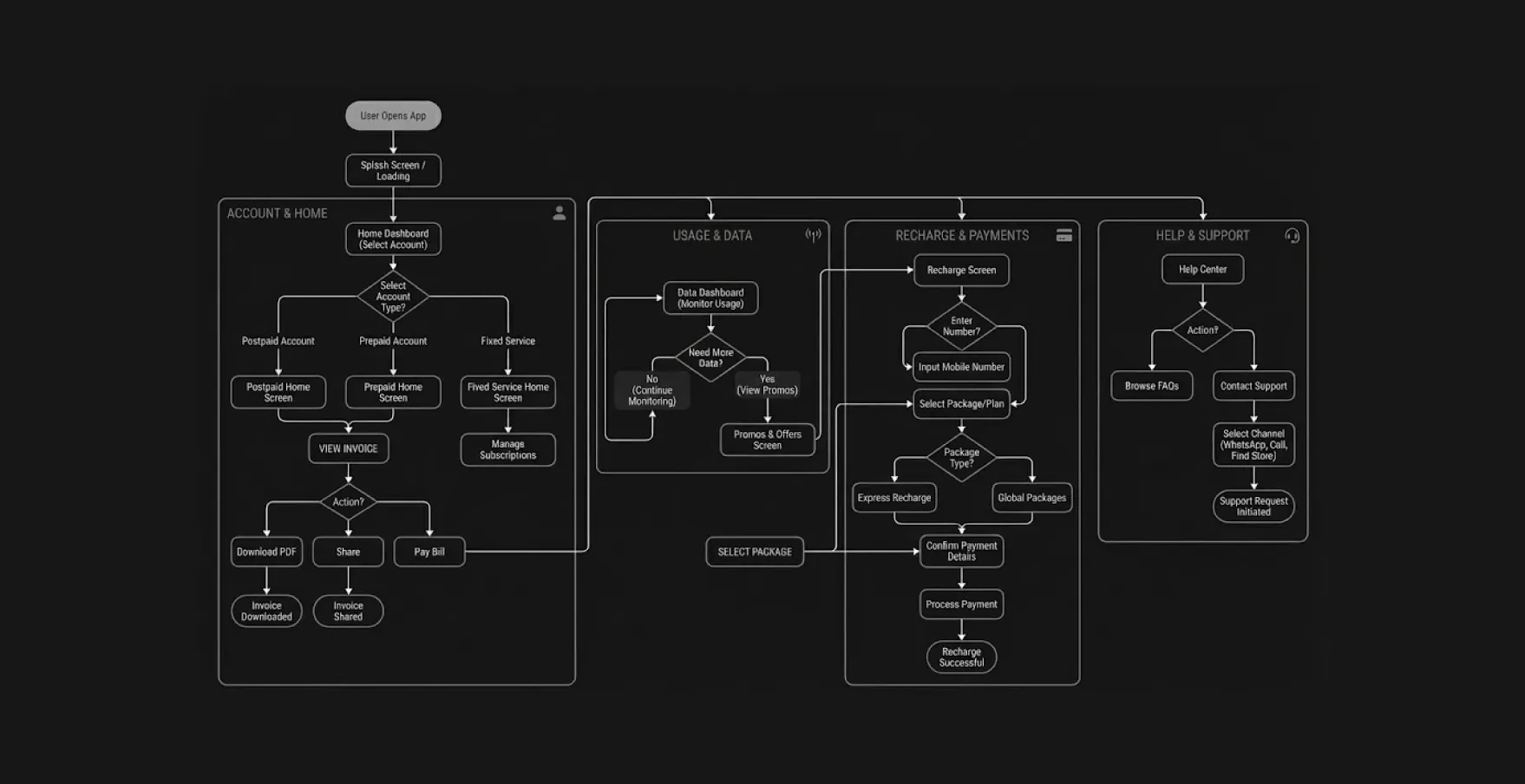
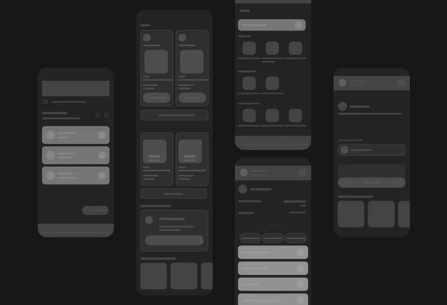
Process & Solution
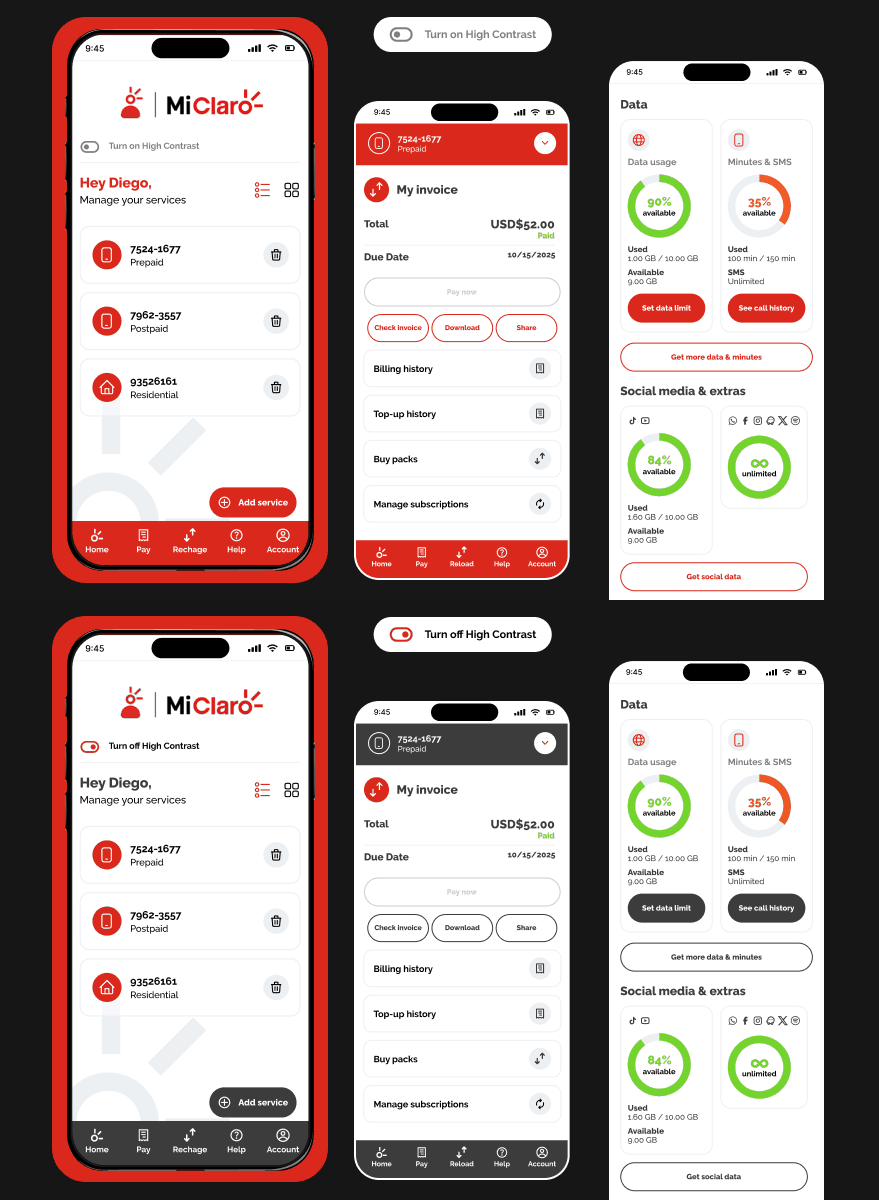
Early wireframes were used to validate flow logic before visual refinement. AI-assisted analysis supported pattern comparisons and early accessibility checks, helping identify contrast and hierarchy improvements early in the process.
Business Impact & Operational Value
The redesigned app experience focused on reducing friction in the most frequent self-service actions, such as checking balance, managing plans, and completing quick transactions. By reorganizing navigation around real usage priorities, the app supports faster decision-making and reduces the effort required to complete routine tasks.
From a product and business perspective, this clarity helps lower interaction costs across the ecosystem. When users can solve common needs independently and without confusion, the reliance on customer support decreases and trust in the digital channel increases. The scalable structure also makes it easier to introduce new features or services without overloading the interface, supporting long-term product growth while maintaining usability.