Design that drives action

Menu

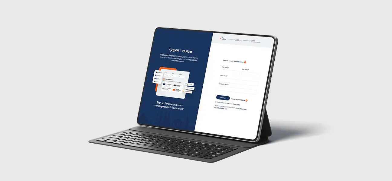
Reduced friction in the registration flow by breaking a long form into clear, guided steps
Lowered abandonment risk in a high-intent moment of the user journey
Strengthened trust and brand continuity after the BHN acquisition through clearer co-branding
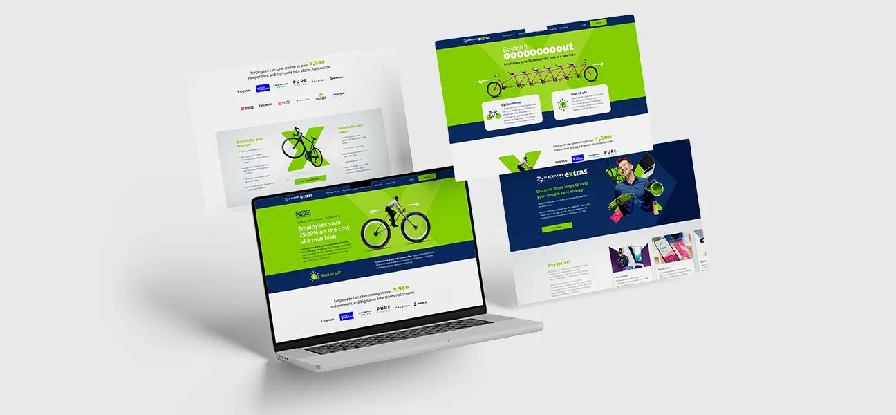
Created a scalable foundation for future optimization through A/B-tested creative approaches
Improved clarity around the product value during sign-up, reducing early confusion

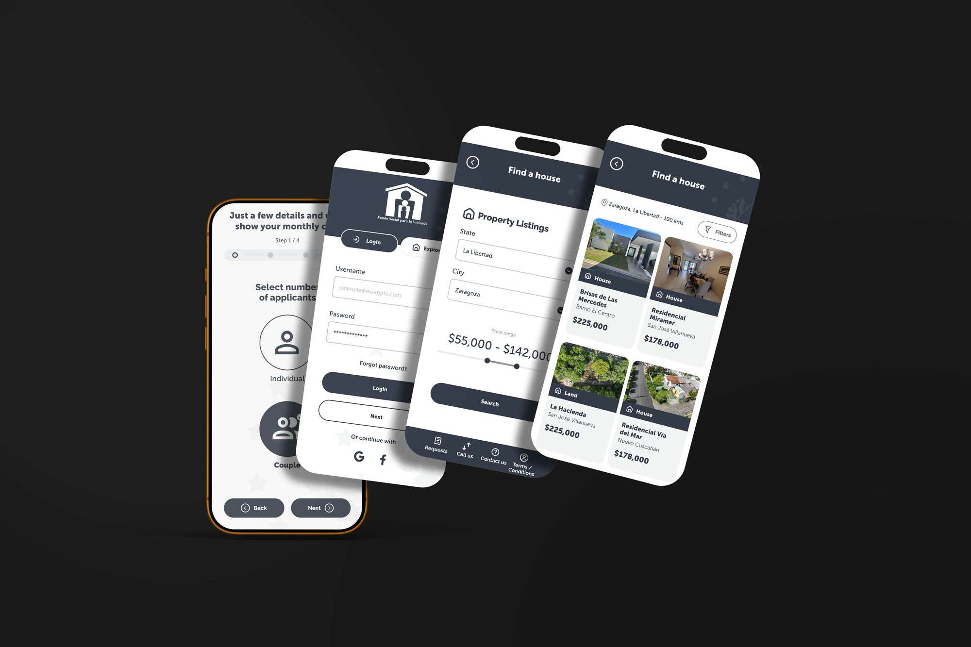
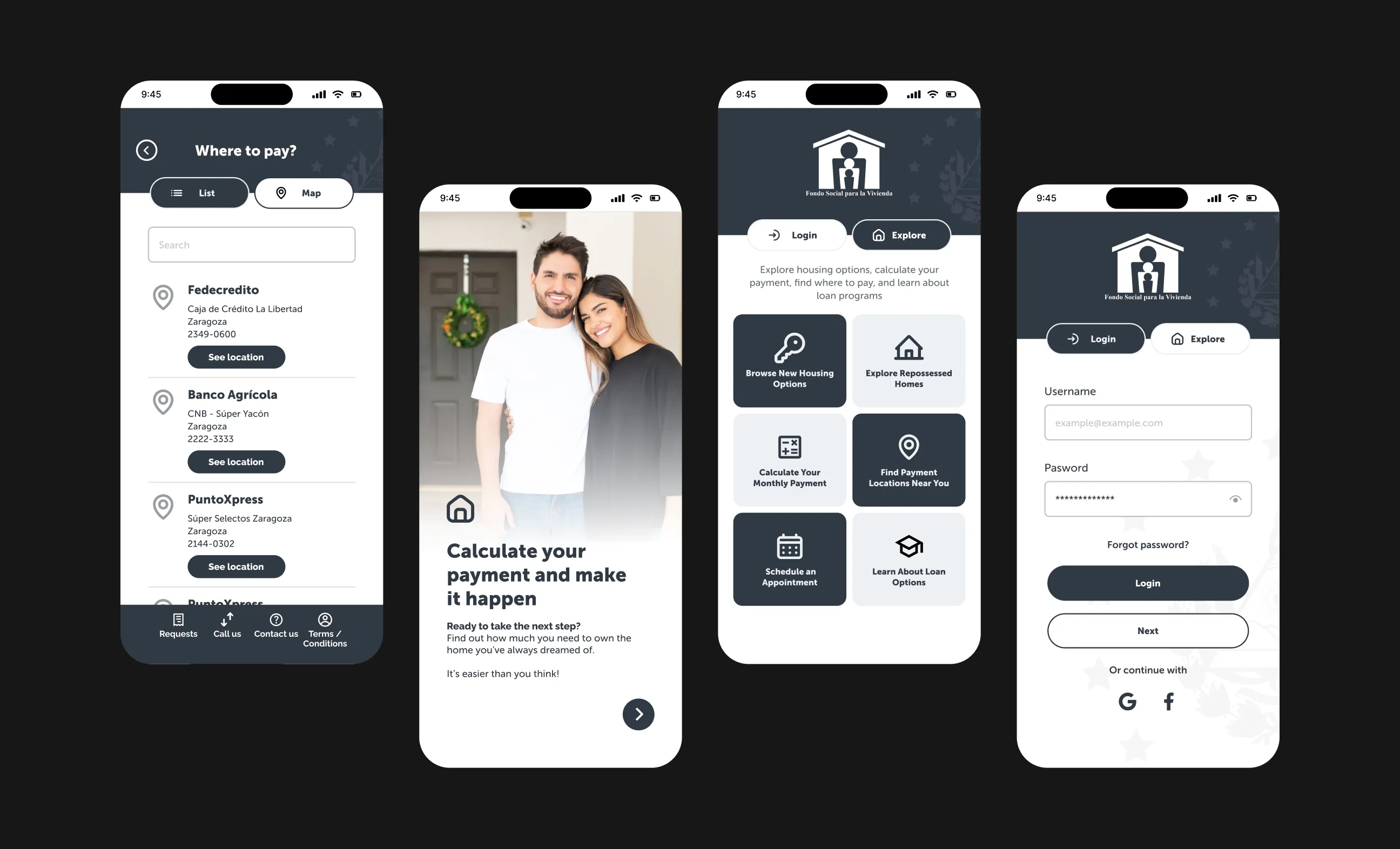
FSV (Fondo Social para la Vivienda) is a public housing platform that allows citizens to explore housing programs, simulate mortgage quotas, and track application progress. The original mobile experience presented all services together with limited guidance, making it difficult for users to complete key actions confidently.
This redesign focused on structuring tasks, improving information hierarchy, and guiding users through complex decisions in a clearer, more intuitive experience.
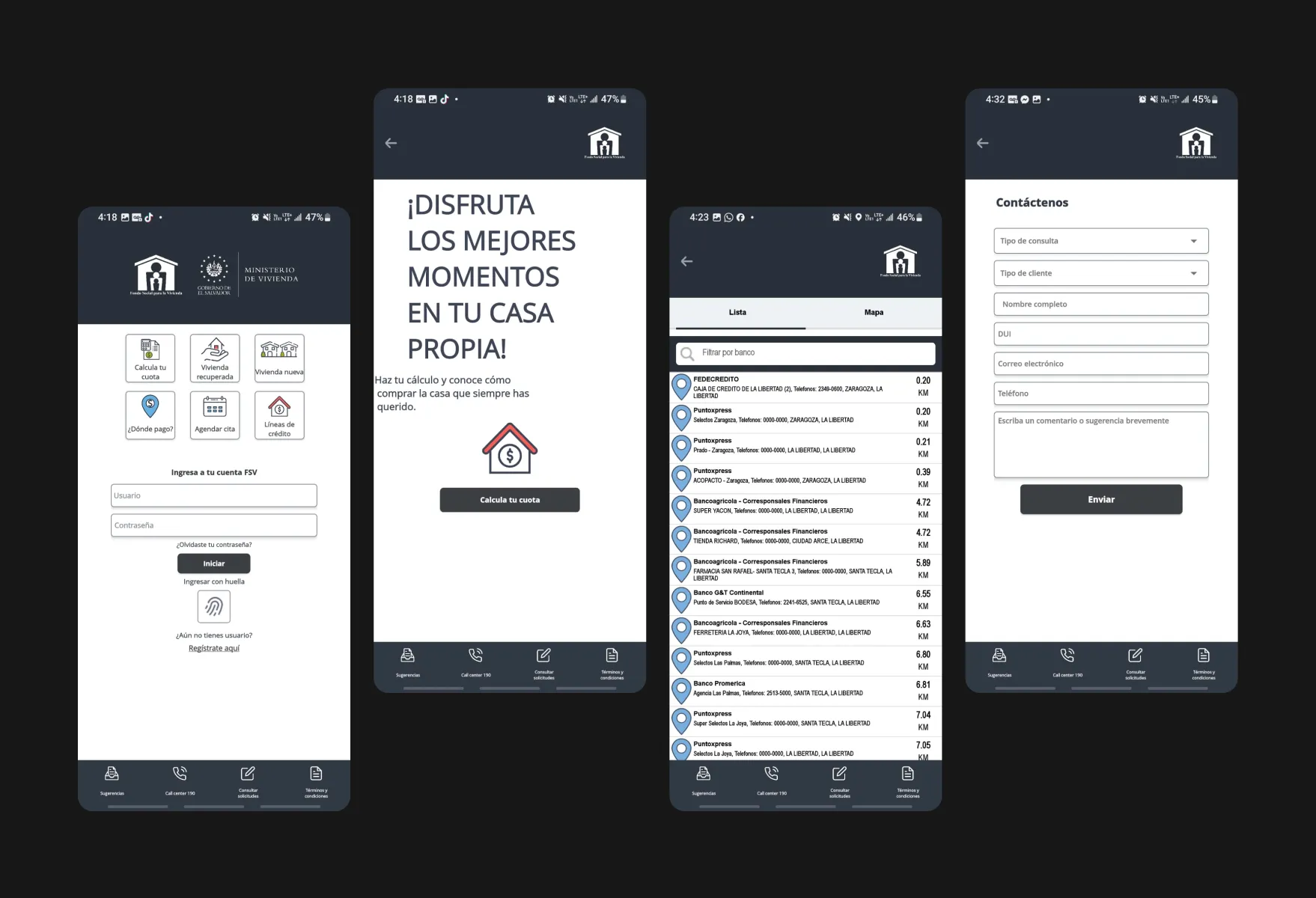
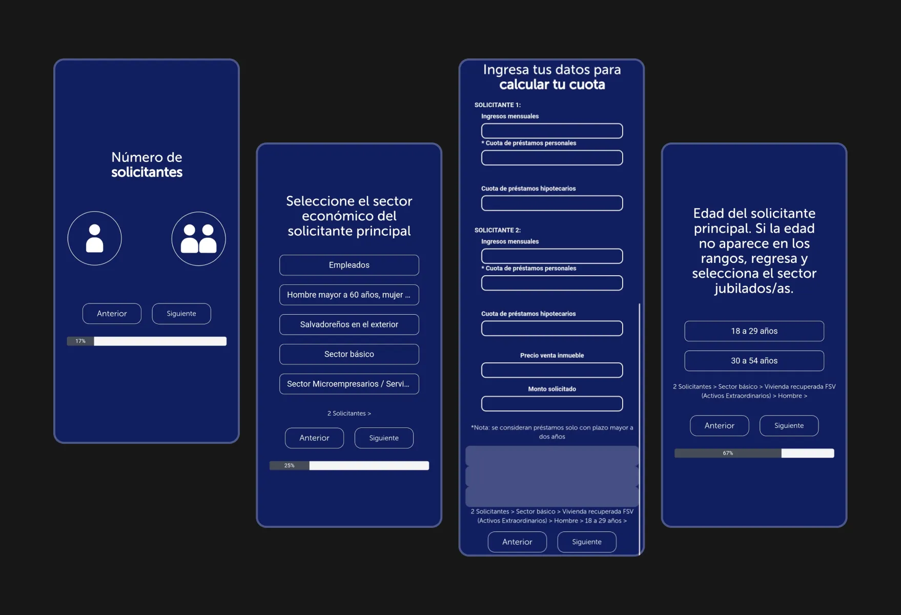
Understanding the Core Problem Behind the Redesign
Users struggled with basic actions such as finding suitable housing options, calculating monthly quotas, or knowing what documentation was needed to apply. The experience lacked clear guidance and prioritized information poorly, leading to frustration and abandonment.
Key questions helped guide the redesign:
Constraints & Context
These constraints demanded a solution that improved understanding without changing the underlying service logic.
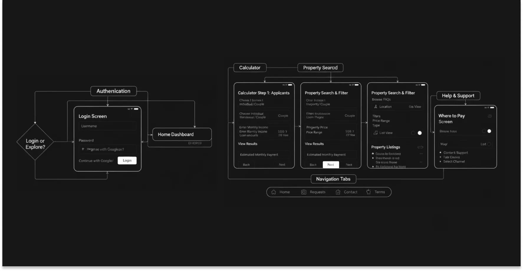

Process & Solution
The redesign centered around clarity and progressive guidance:
Wireframes were validated early with internal stakeholders to refine flow and content structure before visual refinement. Accessibility checks ensured that typography, contrast, and interaction patterns supported readability and clarity.
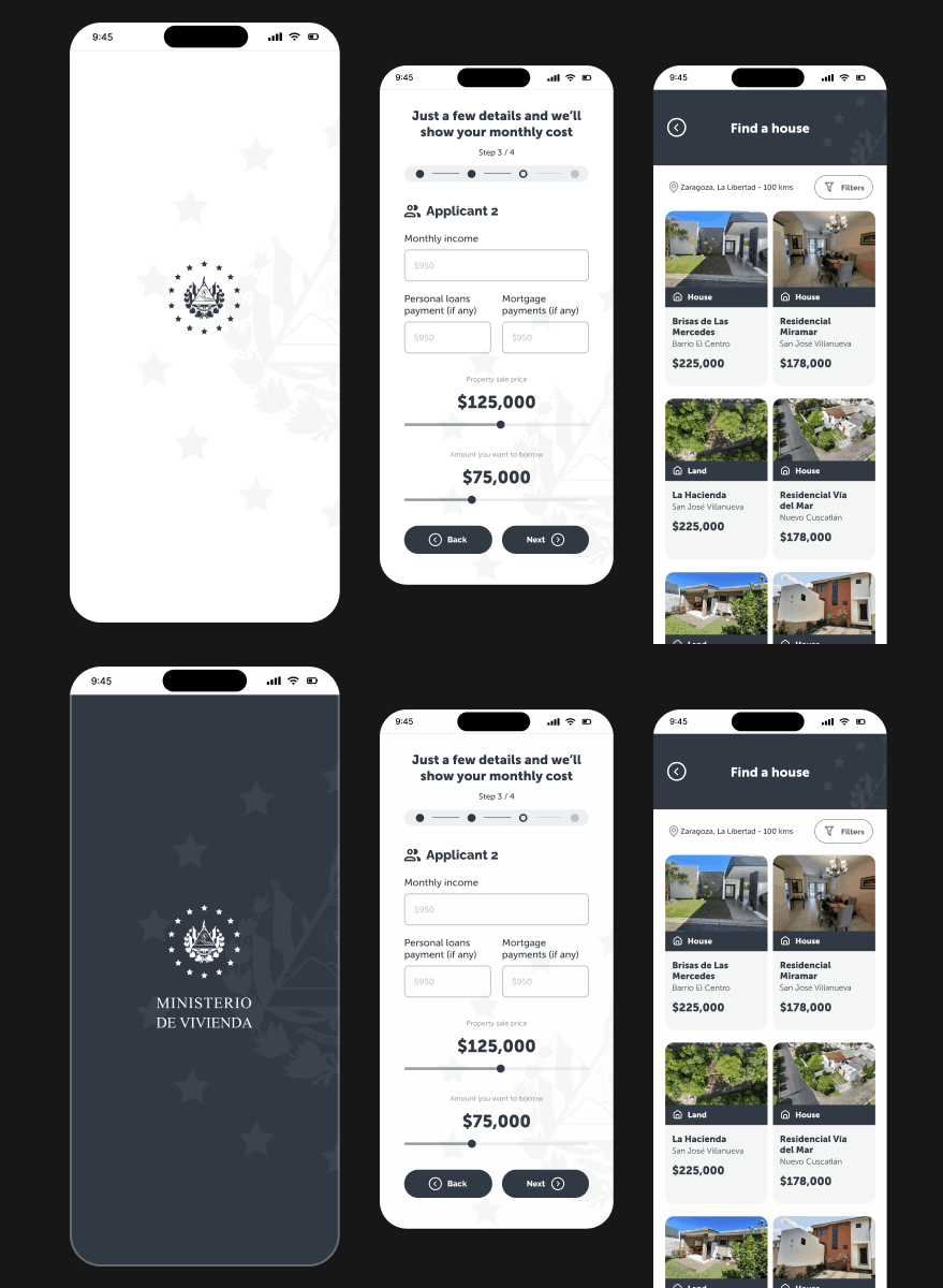
Business Impact & Operational Value
The revised experience helps citizens understand their housing options and mortgage commitments without feeling lost or overwhelmed. By breaking down tasks into understandable steps and reducing information noise, users are less likely to make errors or abandon the process midway.
From a business and operational standpoint, clearer guidance reduces repeated user inquiries and support requests triggered by misunderstood steps. This improves internal efficiency and positions the mobile experience as a reliable digital entry point to broader institutional services.